Thursday 8 December 2011
Thursday 24 November 2011
Tuesday 22 November 2011
Monday 21 November 2011
Wednesday 16 November 2011
Tuesday 15 November 2011
Monday 14 November 2011
Thursday 10 November 2011

How to make an infographic
Not really a tutorials but a nice short piece on the process from a pro designer
Tuesday 8 November 2011
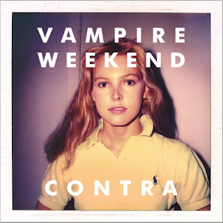
Best Album Art work
Tuesday 1 November 2011


Monday 31 October 2011
Thursday 27 October 2011


Tuesday 25 October 2011
How To Use Canon EOS 40D Digital Camera part 1 of 11
Will work with the Canon 1000d and 400 d handy if you are taking these out for the weekend etc.
Tuesday 18 October 2011
Merchants of Cool Documentary
http://www.pbs.org/wgbh/pages/frontline/video/flv/generic.html?s=frol02p70&continuous=1
http://www.pbs.org/wgbh/pages/frontline/shows/cool/
Lou Reed and the Velvet Underground
http://en.wikipedia.org/wiki/The_Velvet_Underground
http://en.wikipedia.org/wiki/Andy_Warhol
Wednesday 12 October 2011
A day without Helvetica
Extract from the book
JUST MY TYPE: A BOOK ABOUT FONTS
By Simon Garfield
He also cites the remarkable experiment conducted by Cyrus Highsmith, who tried to get through a day in New York without encountering Helvetica but found it on his clothing (washing labels), yogurt, computer, newspaper, money and even on a menu in Chinatown.
A rather long post about Fonts Helvetica
JUST MY TYPE: A BOOK ABOUT FONTS
By Simon Garfield
Illustrated. 356 pages. Gotham Books. $27.50.
New York Times Review By JANET MASLIN
Published: August 21, 2011
Font wonks fight. They champion some typefaces and sneer at others. They go ballistic if a system of signage is altered, as when Ikea changed its designated corporate font from Futura to Verdana in 2009. And they show off tribal symbols. A T-shirt that is depicted in Simon Garfield’s “Just My Type: A Book About Fonts” is adorned with nothing but the ornate ampersand of the font Caslon. This graphic, Mr. Garfield remarks, is capable of “occasionally eliciting a nod from another aficionado, like smug fans of a cool pop band before it becomes famous.”
Sometimes (as with Ikea’s typeface treachery) a tipping point will rock the world of fonts. “Just My Type” should be one of them. This is a smart, funny, accessible book that does for typography what Lynne Truss’s best-selling “Eats, Shoots & Leaves” did for punctuation: made it noticeable for people who had no idea they were interested in such things. Your friends’ eyes may glaze over when you begin to regale them with the font-related trivia with which this book is packed. (What is the Woody Allen movie credits font? Windsor.) If that should happen, recommend that they read Mr. Garfield too.
A sizable swath of the population knows all about font design for reasons having to do with livelihood. After all, knowledge of fonts is essential to advertising, book publishing, professions (like law) that require thoughtfully chosen stationery and any written work that can be done on a home computer. Personal computers are the main reason that font fandom and do-it-yourself design have snowballed in the last two decades. Had Steven Jobs not taken a shine to calligraphy as a college student and decided to include a choice of fonts in computer software, we might not be having this conversation.
Mr. Garfield’s book overlaps with Gary Hustwit’s 2007 documentary “Helvetica,” which concentrated entirely on a single, unstoppably popular typeface. Is global proliferation of the very Swiss, clean, antiseptic Helvetica a welcome phenomenon, or is Helvetica the weedy, unstoppable kudzu of the design world? Mr. Garfield takes a somewhat jaundiced view of Helvetica mania, but he hardly limits himself to one narrow school of fontificating. A full look at font history, aesthetics, science and philosophy could fill an encyclopedia, but “Just My Type” is an excellent gloss. Mr. Garfield has put together a lot of good stories and questions about font subtleties and font-lovers’ fanaticism.
“Just My Type” covers phenomena including how the fonts on road signs are tested for legibility and what the fonts used by various political campaigns subliminally communicate about candidates. It explains relatively arcane matters like kerning (the science of spacing letters) and the wonderful name of one early Fleet Street printer: Wynkyn de Worde. (There is a Wynkyn de Worde Society that holds regular meetings.) And if it does nothing else “Just My Type” will make it impossible for you to look at logos, road signs, airports, magazines and advertisements indifferently any longer.
One typically buoyant chapter is called “We Don’t Serve Your Type” and devoted to Comic Sans. Setting a “Do Not Enter” sign in this comic-book-style typeface has been called “analogous to showing up at a black-tie event in a clown costume” by two of this font’s haters, Holly and David Combs, who started a movement to have it banned. “A place where it doesn’t look great, in my opinion, is on a tombstone,” says Mr. Combs, although he has actually seen Comic Sans used that way. As for the name of this font, a patient explanation that “sans” designates a sans serif font as opposed to a serif font is part of the book’s Font 101.
Mr. Garfield moves on to the modernists, talking to many of the renowned designers who appeared in “Helvetica.” In a chapter called “What Is It About the Swiss?” he plumbs the 1957 creations of both Helvetica and Univers and the Swiss modernism that spawned them. He also cites the remarkable experiment conducted by Cyrus Highsmith, who tried to get through a day in New York without encountering Helvetica but found it on his clothing (washing labels), yogurt, computer, newspaper, money and even on a menu in Chinatown.
The book also zeros in on the much-despised Arial, Microsoft’s Helvetica lookalike. And it makes the interesting point that it has proved difficult to protect fonts in court, since an alphabet can be regarded as being in the public domain. But for anyone with the patience and wherewithal to do so, each letter, number and glyph can be individually copyrighted. And Arial, in Mr. Garfield’s opinion, turns out to have enough tiny deliberate changes from Helvetica to make them as different as pineapple and mango.
Among the many other matters of interest in this bright little book: how the @ sign is named in different languages (it’s a rollmop herring to the Czechs, an escargot to the French); the rock ’n’ roll secrets of Rolling Stone magazine’s big, shaded “R” and the Beatles’ lowered “T”; the dark biographical stories behind designers of some of the cleanest-looking fonts (as with Eric Gill and his Gill Sans); how Gotham helped win the presidency in 2008 because it was “a type chosen consciously to suggest forward thinking without frightening the horses”; and the worst fonts in the world.
One of these is seen throughout the movie “Avatar” and on at least one T-shirt that James Cameron wore while directing it. So what looks like Papyrus didn’t get into that movie by accident. This story didn’t get into Mr. Garfield’s sparkling book by accident either.
Tuesday 30 August 2011
Subscribe to:
Posts (Atom)